My Dark Dashboard Design Doesn't Fake Good News
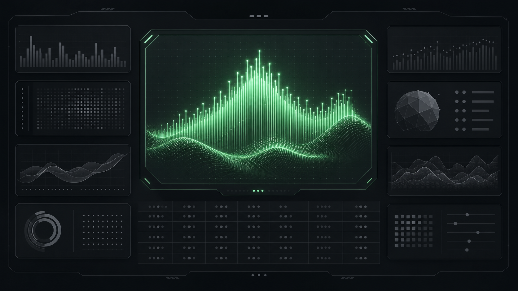
I designed my blog’s stats page to look like a spacecraft instrument panel. The styling has exactly one job: when a post has no signal yet, the panel says “gathering signal” and stops there.
That’s the dark dashboard design behind /stats/, and the rule applies to itself too. It tracks search data over a rolling 28-day window: whether a post gets impressions at all, and whether any of those impressions turn into a click. The styling is load-bearing: strip away the mint accent and the mono grid and there’s nothing stopping a panel from lying by omission the day a post has nothing to report.
Every dashboard looks like the same template
Open ten analytics tools and the same page repeats itself ten times over. Bright white background. A cheerful blue gradient near the top. Every line trending up and to the right, or close enough that nobody clocks the difference. Green badges on numbers that barely moved. A page built to look encouraging will find a way to look encouraging: round a flat number up until it reads like a win, pick a color that says “good” no matter what it’s attached to. Fine. For a marketing page selling optimism, that’s the job. A page claiming to tell me the truth signs a different contract, and the SaaS dashboard template (the default analytics dashboard UI design that most tools ship) was never built to keep it.
Built like an instrument panel
This is the dark dashboard design behind /stats/: an instrument panel. An instrument panel just reports. It reports altitude. It reports fuel level. If fuel runs low, the needle doesn’t ease toward the middle to soften the blow. That’s the panel I check before I decide whether a post’s search angle worked or missed: two gauges, impressions and click-through. Both gauges stay exact, with nothing rounded to make the panel look better. If it lied to me the way a marketing dashboard would, I’d be making that call off a gauge I couldn’t trust. A page whose only job is telling me what’s true, even when what’s true is nothing yet.
Color discipline: charcoal, one accent, everything else quiet
Background sits at #0c0e12, a matte charcoal a step above true black. Panels: a slightly lighter #13161c, just enough to lift off the base without turning shiny. Text runs a warm off-white: full white against full black is the pairing that tires eyes fastest. That lines up with Wendy Zhou’s dark-dashboard guidance: dark grey over true black, cards one shade lighter than the page, text light grey instead of stark white. Most of the data stays muted too, with strong color reserved for the numbers that matter.
Mint (#a3f7bf) is the one accent color on the page, and it’s reserved for chrome. One other place on /stats/ carries mint: a live pulse. When a post is ranking, its status line goes mint end to end: dot and label both, the target keyword’s average position included. That’s a deliberate exception to the rule: a single status flag reporting one binary fact, ranking or not. Every panel’s own hero number and metric grid stay a neutral off-white whether a post is crushing it or reads zero. I kept the color rare on purpose: if mint colored the metrics too, chrome and signal would blur together and the accent would stop meaning anything. It marks every panel as its own instrument.
A serif number, then a grid that lines up
Data dashboard typography is where I sweated the most for the least visible payoff. Each panel leads with a hero number set in Instrument Serif, big enough to read from across the room, doing the job a headline does on a page. Below it, supporting metrics sit in a grid set in JetBrains Mono. Every character in a monospace font is exactly the same width, digits included, so a column of numbers lines up. 124.17 sits directly under 680.90, decimal under decimal, without drifting the way it would in a font where a “1” is narrower than an “8.” Datawrapper’s data-typography piece makes the same alignment case for tabular figures, though its own default recommendation is tabular figures inside an ordinary proportional font, not full monospace. Going full mono gets me that same alignment, plus the code-comment look the rest of the panel already leans on.
The serif carries the one number that matters most. The mono grid carries the rows meant to be scanned side by side. I know it sounds like fussing over half a pixel: I am, on purpose, because a column that drifts is the fastest way to stop trusting a table of numbers.
The charts are real now, and they follow the same rules
As of July 2026, /stats/ runs real time-series charts: a 28-day two-series traffic line and a search impressions/clicks small-multiple pair. Weekly bars break out traffic by surface, and per-post sparklines close out the lineup. Two more panels flank them. One breaks traffic down by source: organic and direct, plus referral and other. The other lists the top search queries bringing people in. Everything renders as build-time SVG, new work built after the original round of blog plumbing (newsletter, comments, nav) wrapped back in February. Series colors are green (#1ea855) for views and blue (#4c78dd) for sessions and search. That pairing also happens to sidestep red and green, the combination that trips up the most common form of color blindness, while brand mint stays chrome-only.
The charts joined the same contract the tiles already signed: a trend line has to be earned by data, and a missing trend renders as “gathering signal” in the same flat grey. That exact wording appears on all five trend panels: traffic, search, surface, sources, queries. The per-post sparkline, a different component, reads “no signal yet” instead. Same grey, same rule against faking a trend, just not identical wording.
The SVG geometry is drawn once at build time, straight from real numbers. Hover a point on the traffic or search charts and a small tooltip surfaces the exact value already baked into that spot. The chart itself never reshapes to flatter the numbers. Boring beats misleading, every time.
The signature marks: a mint border and a // label
Every panel carries the same two marks. A thin mint top border, two pixels of color along the top edge of an otherwise grey card. And a panel label set in mono, prefixed with //, the way a comment reads in code: // traffic (28d), // search (28d). Take the border and the // label away and it reads like every other telemetry dashboard design. The two pixels of mint and one slash-slash comment are the entire difference between generic and mine.
Dashboard empty state design: “gathering signal” claims only what’s true
This is the piece I’d defend hardest. When a post has no search data yet, the panel says “gathering signal,” in flat grey, and stops there. It declines the easy fakes: a soft yellow “warming up” glow, a zero rounded up to look like a trend that hasn’t started.
Nielsen Norman Group’s empty-state writeup calls out exactly the failure I was trying to avoid: showing no data on a panel that’s still loading, so a temporary state reads as a permanent fact. Its own worked example is a page that flashes “No records” before the real content finishes loading. For NN/g that’s a page still loading; for /stats/ it’s a metric that hasn’t had enough calendar days yet to say anything. The clock is different. The confusion it produces isn’t. NN/g calls it exactly what it is: a failure that destroys trust in an interface.
Lie once on a dashboard and every other number on it stops being trusted too. “Gathering signal” claims exactly two things: collection is running, and nothing has come back yet. It should claim nothing more. NN/g’s own guidance goes a step further than a neutral label: it recommends giving users a direct pathway to whatever action closes the gap — a button or link straight to the step that would populate the empty state. I skipped that layer on purpose: there’s no button that speeds up two weeks of search impressions, so the honest move here is a plain label.
I’ve already written up the scorecard behind this page: most of its tiles currently read NOT YET, with a handful reading GATHERING SIGNAL. Both are the same flat grey with nothing rounded up, because a few weeks of impressions is too little to call anything yet. /stats/ is the visual skin on that same honesty. That’s a bet against my own instincts too: a build-in-public page that mostly says “gathering signal” looks like nothing is happening, and I shipped it anyway.
Go look at it yourself
Words on a page can only make this case so far. Pull up the live dashboard, find a post that hasn’t picked up any search traffic yet, and watch it handle that dashboard empty state: “gathering signal,” plain grey, nothing dressed up. That’s the whole bet behind this dark dashboard design: it only means something if it holds up on a post with nothing to report. Go find one. And if you want the values for your own dashboard, they’re right above: #0c0e12, #13161c, #a3f7bf, Instrument Serif over JetBrains Mono. Steal them.