A Design System With CSS Variables (No Framework)
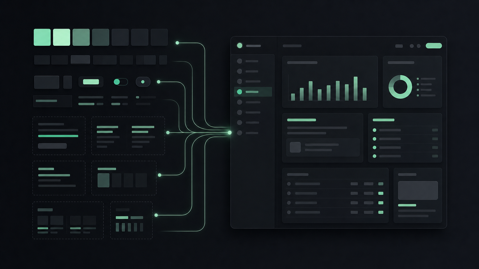
The charcoal panels and the mint accent on this site come from one file: a :root block in global.css. So does the serif in every headline on this page. That’s the whole design system with CSS variables behind buildaloud.ai. There’s no Tailwind config generating utility classes and no Style Dictionary build step exporting tokens ahead of time. Colors and fonts are named once, and almost every component points at those names instead of a raw value.
A :root block, plus the discipline of using the names I picked, is the whole system: less machinery than it sounds like it should.
Why a blog this small needed a system at all
I almost skipped this. It’s a blog (markdown files, a stats page, a like button), small enough that a design system felt like overkill. Then I looked back at what I’d actually shipped.
The stats dashboard landed on a panel background I picked in the moment, some charcoal that felt right at the time. The like button’s container needed a panel color a few weeks later, so I picked again, from memory. It landed close but not identical, as best I can reconstruct it now: one came out around #12151a, the other #13161c. Near enough that a glance wouldn’t catch it, different enough that no diff would have caught it after the fact either. A few more rounds of that kind of guessing and the site starts feeling like a pile of pages that happen to share a domain. Name the values once as CSS design tokens, then hold the line on using those names: that’s what stopped it cold.
The mechanism: CSS custom properties inherit through :root
The mechanism underneath all of this is CSS custom properties, declared once on :root. MDN is straightforward about what that buys you: a property set on :root is available globally. Custom properties inherit down the DOM the same way color or font-family does, so every child element can read them with no extra wiring. Set --mint: #a3f7bf; once in that block, and I never touch it again. Any element anywhere on the site reads var(--mint) and pulls the same value from that one source.
The real token block: primitives, semantics, fonts, layout
Here’s the :root block, trimmed to what matters and grouped instead of dumped as one flat list. Primitives first, holding the raw values. Semantic names underneath, pointing at those primitives instead of duplicating them.
:root {
  /* primitives: ink scale */
  --ink-900: #0c0e12;
  --ink-800: #13161c;
  --ink-700: #1a1e27;
  --ink-600: #262c38;
  --ink-500: #3a4258;

  /* primitives: paper scale */
  --paper: #e8e6e1;
  --paper-dim: #9ca3af;
  --paper-faint: #6b7280;

  /* primitives: accent */
  --mint: #a3f7bf;

  /* semantic: what components actually read */
  --color-bg: var(--ink-900);
  --color-bg-elevated: var(--ink-800);
  --color-text: var(--paper);
  --color-text-secondary: var(--paper-dim);
  --color-muted: var(--paper-faint);
  --color-accent: var(--mint);
  --color-accent-dim: color-mix(in srgb, var(--mint) 12%, transparent);

  /* fonts */
  --font-display: 'Instrument Serif', Georgia, serif;
  --font-body: 'DM Sans', -apple-system, sans-serif;
  --font-mono: 'JetBrains Mono', 'Fira Code', monospace;

  /* layout */
  --max-width: 52rem;
  --max-width-wide: 75rem;
  --gutter: 1.5rem;
}
Grouping matters more than the count. Ink answers “what’s the surface.” Paper answers “what’s the text.” Mint is reserved for the one thing that should grab your eye. A component always reaches for the semantic layer, and the primitives stay one level removed. Nothing in this codebase writes var(--ink-800) by hand when var(--color-bg-elevated) already says the same thing with intent attached.
Charcoal depth without shadows
This is where the terminal aesthetic web design vibe on this site starts: two adjacent charcoal primitives encoding a lightness step you can’t eyeball wrong. --ink-900 (#0c0e12) is the matte charcoal underneath everything. One step lighter, --ink-800 (#13161c) maps through --color-bg-elevated, so a panel reads as its own surface without needing a shadow to prove it. The stats dashboard’s panels work that way, and so does the like button’s container. Even mint gets a quieter register: --color-accent-dim is a 12% color-mix() of mint against transparent, for a wash where the full color would shout.
--paper (#e8e6e1) carries full-strength copy, and --paper-dim (#9ca3af) steps down one notch for secondary text. --paper-faint (#6b7280) goes dimmer still, barely trying to be read at all. Only the token names show up inside a component’s CSS; the hex values live in one place.
That last sentence has three real exceptions, and I’m not going to pretend otherwise. The header’s SVG logo mark hardcodes its own fill, #13161c, right in the markup. A stale-data amber, #e0a94c, shows up twice, duplicated verbatim across stats.astro and BlogPost.astro. It’s the kind of drift the token system exists to prevent, hiding inside its own blind spot. And the homepage headline runs its own gradient highlight, #7df0a8, that never made it into global.css at all.
Three typefaces, three jobs
The font tokens split the same way, three typefaces each holding a job the others don’t touch. --font-display is Instrument Serif, with Georgia as the fallback. It owns headlines and the biggest number on a page, the one place the site is allowed to feel designed. --font-body, DM Sans, does the unglamorous job: paragraphs and anything a visitor actually reads start to finish, nothing about it meant to be noticed. --font-mono, JetBrains Mono with Fira Code as backup, handles timestamps and stat readouts, plus the small labels marking off a section. It’s the same font stack that got its first real test in the panel work on the dashboard redesign.
That’s CSS custom properties theming doing its most literal job: a component asks for font-family: var(--font-mono). Swapping which typeface holds that job is a one-line change at the top of the file. The component stays ignorant of it, on purpose. It only ever asked for the job, not the font.
Re-theming from one place: primitives and semantics
Primitive and semantic tokens are the two-layer split that makes the payoff work. Custom properties evaluate live, at runtime. Re-theming the whole site is a matter of overriding a handful of values at the top of one file. CSS-Tricks shows this pattern working in a dark-mode example: reassign a background variable and a text-color variable. Every selector that already uses them picks up the new look, with zero changes of its own.
The layering here goes one step further than that. --ink-900 and --mint are primitives, while --color-bg and --color-accent are semantic names that stand in for those primitives without ever repeating them. Penpot’s case for that extra layer is the one that stuck with me: splitting primitive from semantic means a theme change is remapping which primitive a semantic name points to. Every component that consumes that name is left alone. A lighter theme, or a different accent entirely, is a repoint at the top of global.css.
Nudge a primitive’s own value (a slightly different shade of mint) and the change cascades on its own. Every semantic name still pointing at it updates, and so does every component reading that name, with no other edit anywhere. That live recompute is the CSS Color 5 color-mix() function at work: the browser blends it on the fly, with no preprocessor and no precomputed hex for the dim variant. Primitives hold the values. Semantic names hold the decisions. Repoint one and the decision changes without anyone touching a component.
The system grew a new token group: chart series colors
The layering got a real test on July 14, when the stats dashboard’s charts needed a category of CSS design tokens nobody had planned for at launch: series colors. Two new primitives landed in the same :root block, --series-green (#1ea855) for page views and --series-blue (#4c78dd) for sessions and search, each mapped through semantic names like --color-series-views. They’re the same green and blue chosen for the dashboard’s charts, and that pairing also happens to sidestep red and green, the combination that trips up the most common form of color blindness.
WebAIM puts it plainly: “red-green deficiencies are the most common, meaning that certain shades of the colors red and green may appear very similar.” Mint keeps its usual border-and-label chrome duty around each chart panel, same as everywhere else on the site. Every line and bar in the charts themselves reads straight from the new green and blue series tokens. The comment right above the new primitives in global.css says why: dataviz series colors only, never for chrome, borders, or labels, which all stay --mint.
WebAIM adds one more rule on top of picking safe colors: never make color the only cue. The legend on /stats/ already clears that bar, because each series color pairs with a text label, “views” or “sessions”. The traffic-sources breakdown carries the same pairing for organic and referral. Same rule, wider net. --series-blue ended up doing triple duty: sessions and search both use it, and so does the organic-traffic slice of the sources breakdown, three metrics deep from one declaration.
This is the moment the system proved it was a system. A new requirement showed up and got its own token group, dropping straight into the same file. Every component that already existed kept working, untouched. Even the color choice followed a rule someone (me) wrote down: dodge red and green.
The signature that consistency built
The site’s visual signature came from using the tokens the same way, beat after beat. That consistency held straight through the dashboard redesign that set this border rule. Every panel-level section label runs in --font-mono, prefixed with // like a code comment: // traffic (28d) on the stats dashboard, // telemetry on every blog post’s own stats panel. A two-pixel mint top border does the same job, landing wherever a panel meets whatever’s above it, on the dashboard panels and the blog post telemetry panel alike. The like button keeps a plain all-around border instead, mint only on hover or once someone’s liked the post. The mono-font label prefixed with // is one half of terminal aesthetic web design on this site. The mint top border, repeated on every panel without a single one-off, is the other. The tokens made the same choice cheap to repeat, and that repetition is the site’s visual identity.
Naming discipline is the system
Plain CSS variables did all of this. Name a value once, and hold the line on using that name everywhere it shows up. That discipline is what let this site re-theme from a single file and absorb an entirely new chart-color palette without touching a single existing component. Call it what it is: a design system with CSS variables, nothing else installed.
The whole :root block powering this page is public right now, though the browser hands it back minified. The grouping and comments from the code above don’t survive the build. Open dev tools and find the stylesheet. Every token name and hex value in that block is sitting right there, ready to copy. There’s nothing to sign up for first. The system is the discipline; the file is just where the discipline lives.
Sources
- Build Aloud (buildaloud.ai)
- Build Aloud: My Dark Dashboard Design Doesn’t Fake Good News
- Build Aloud: I Built an Anonymous Like Button Without Login
- Build Aloud: /stats/, the live per-post dashboard
- MDN: Using CSS custom properties
- CSS-Tricks: A Complete Guide to Custom Properties
- Penpot: The Developer’s Guide to Design Tokens and CSS Variables
- WebAIM: Visual Disabilities, Color Blindness